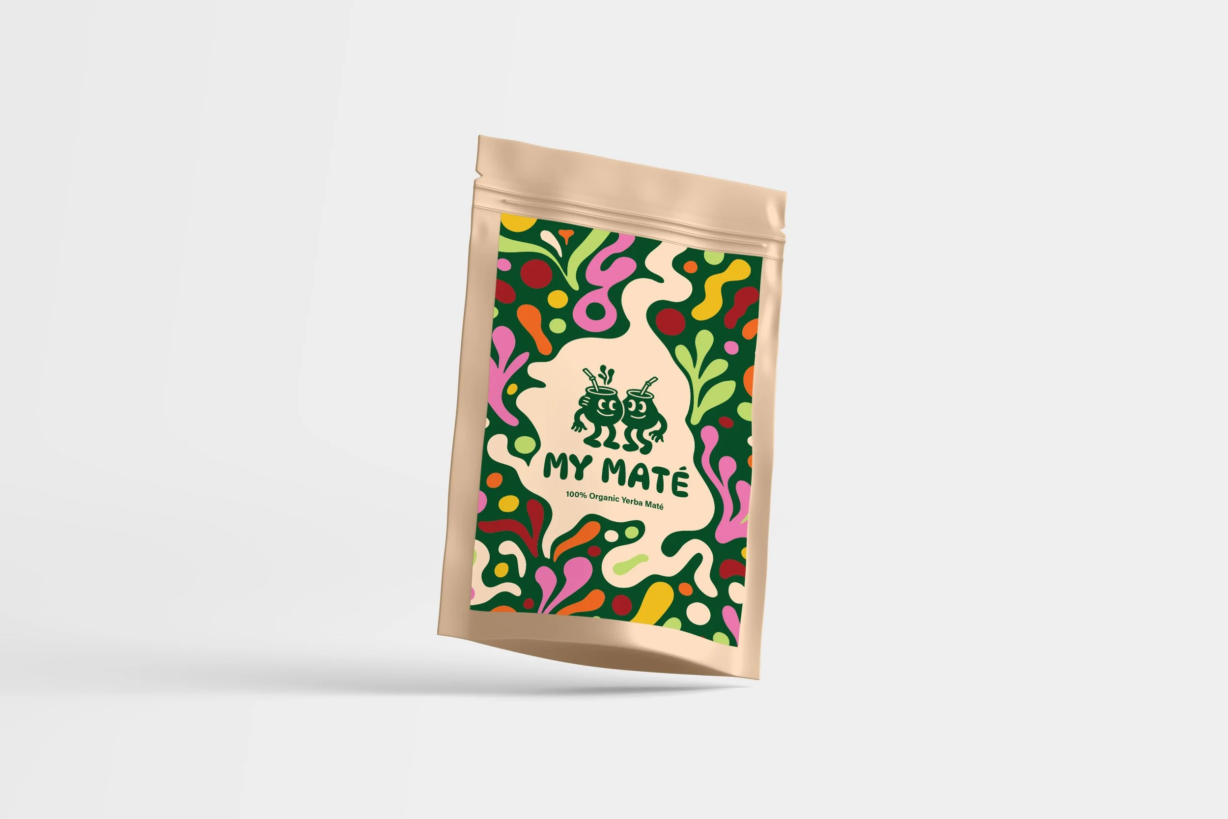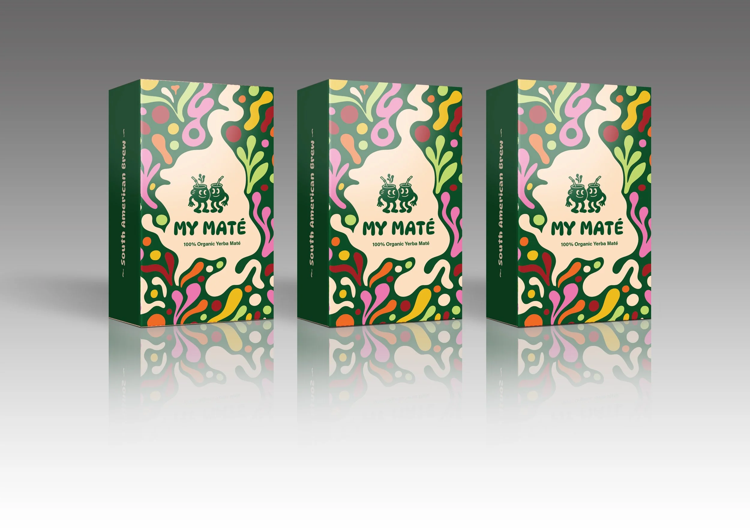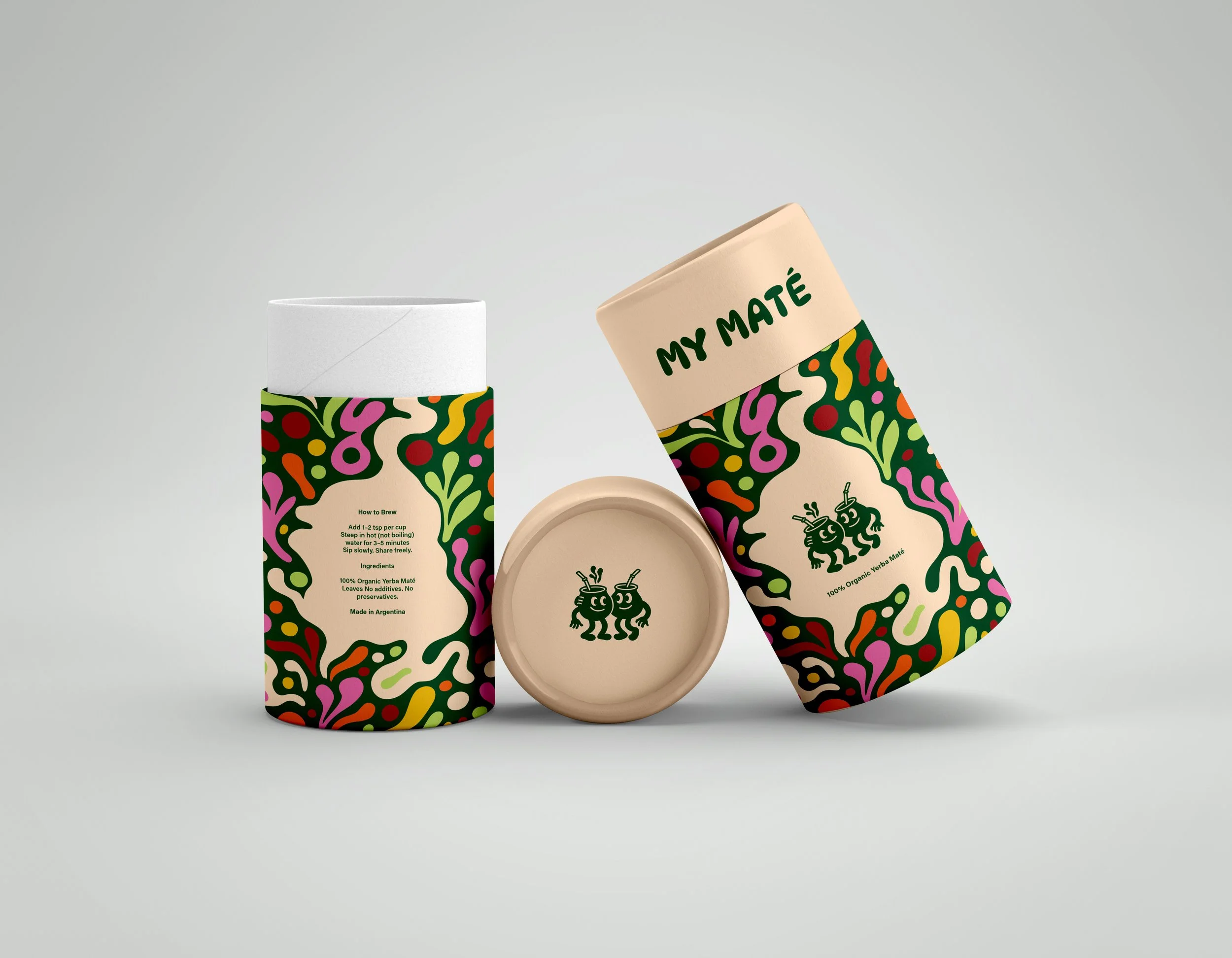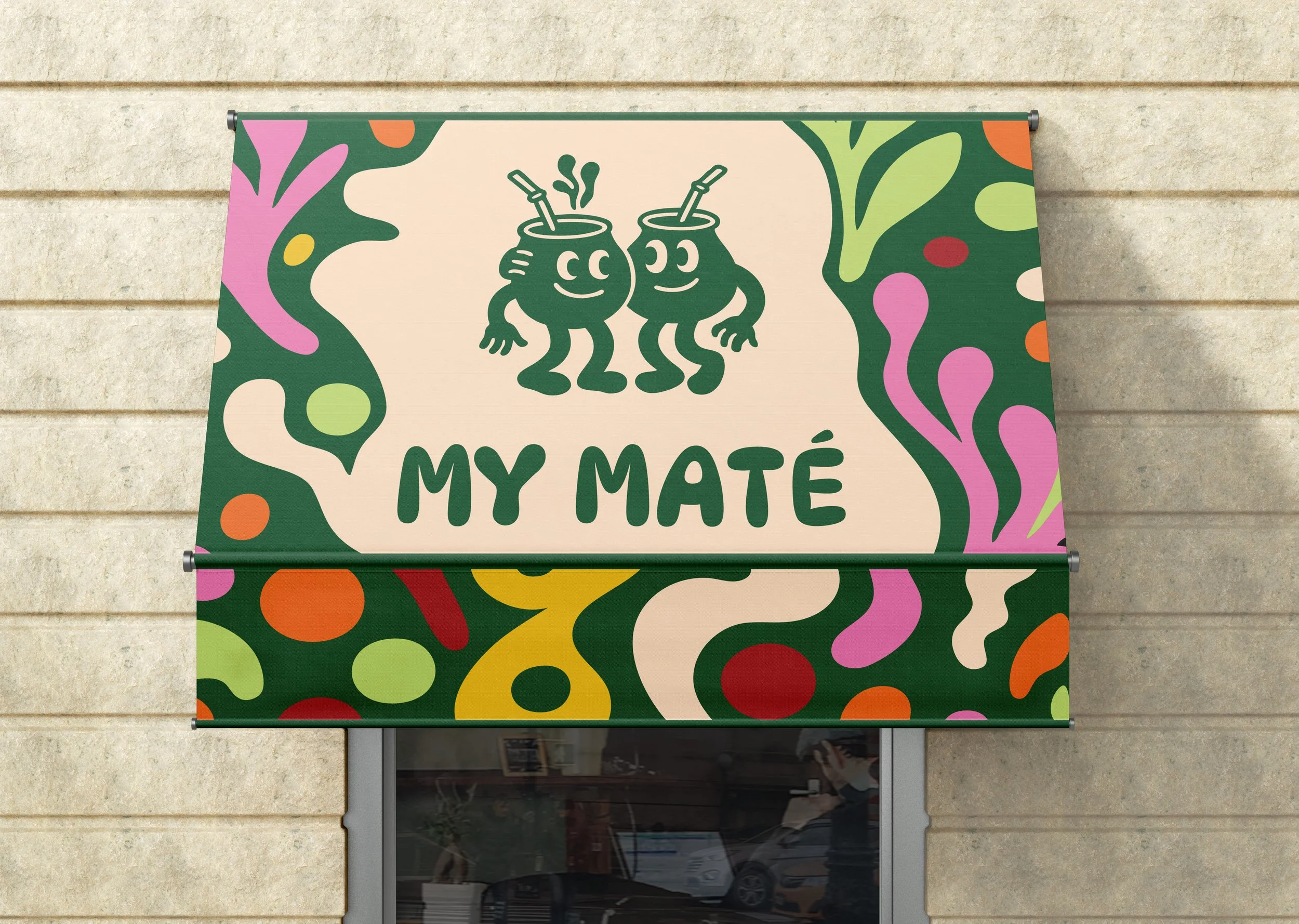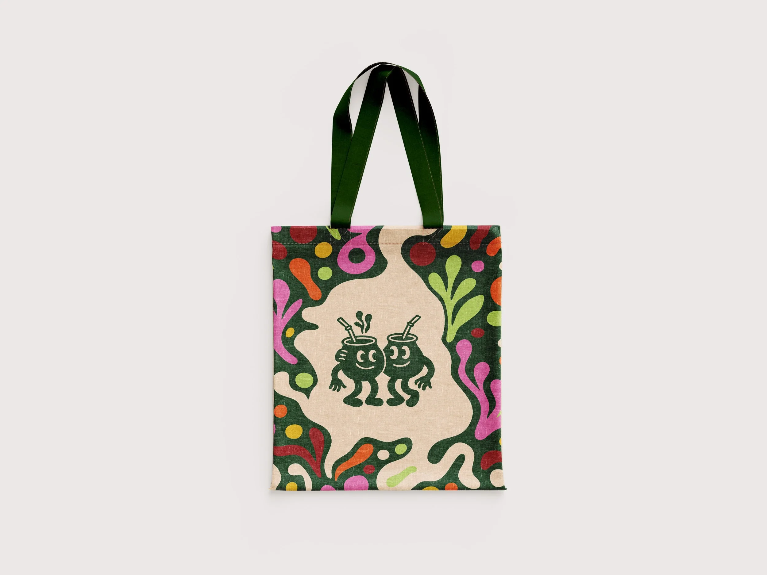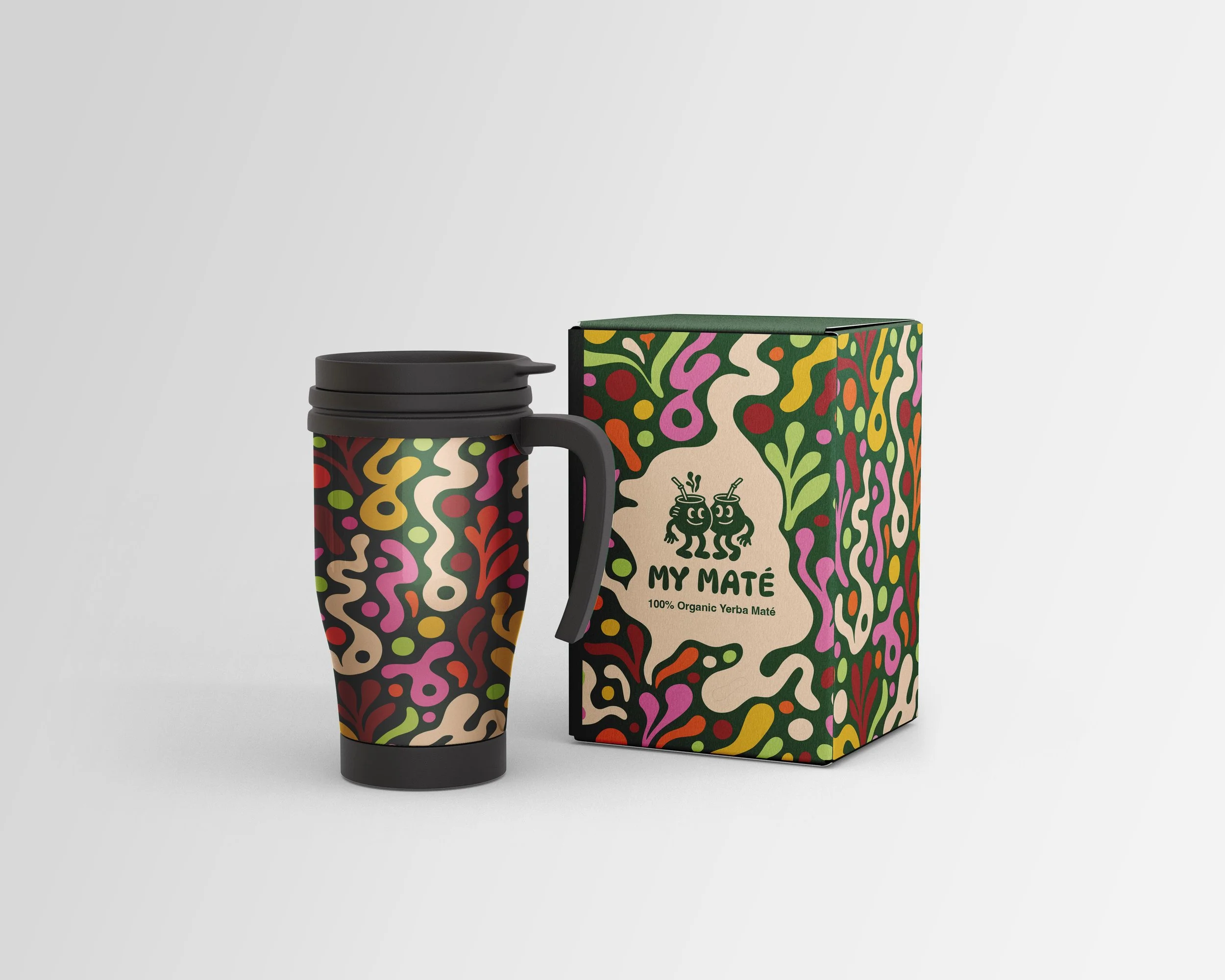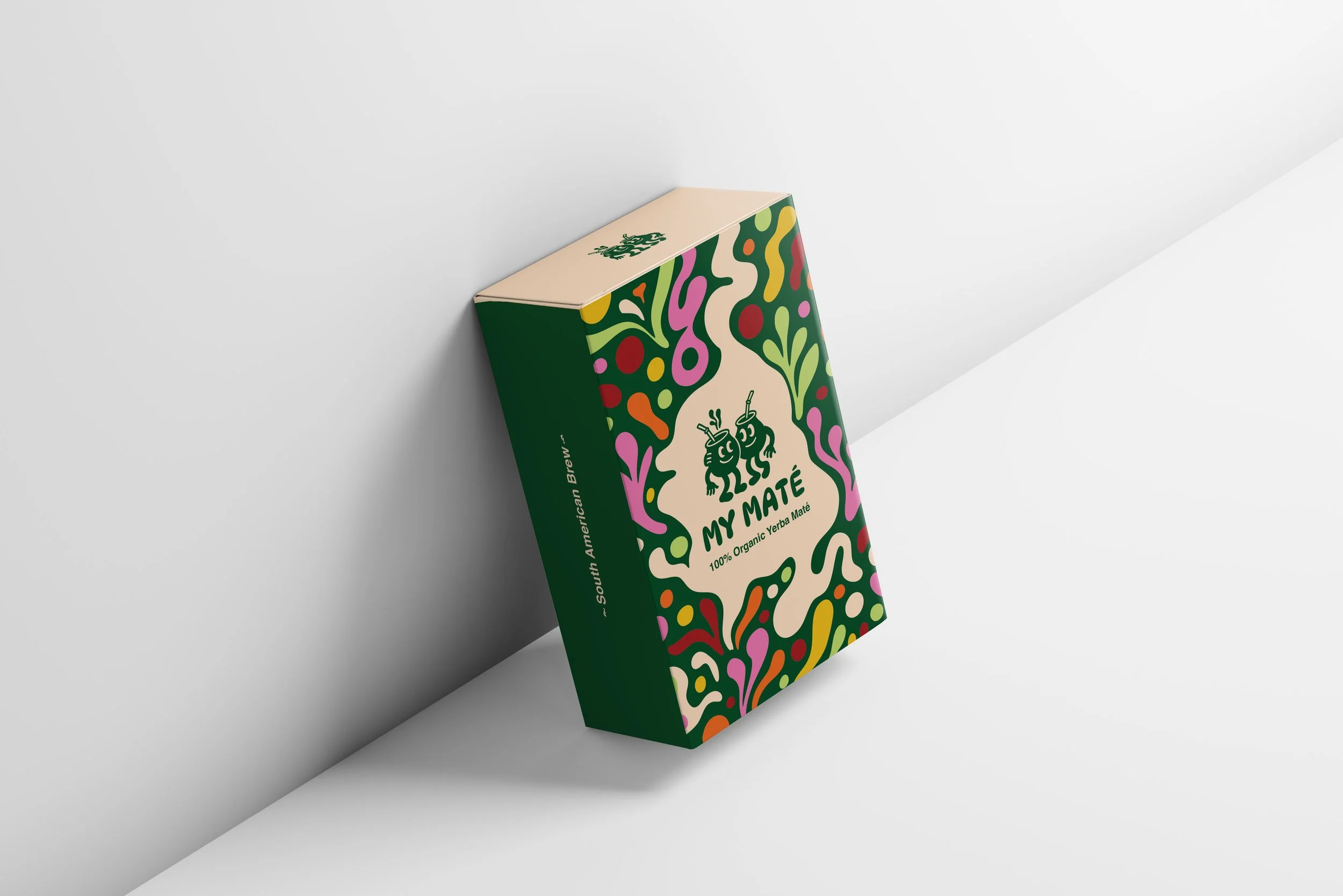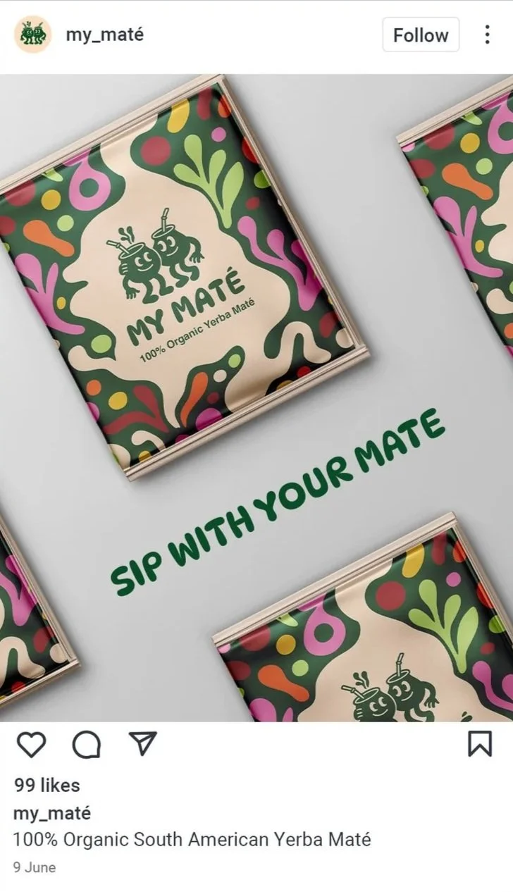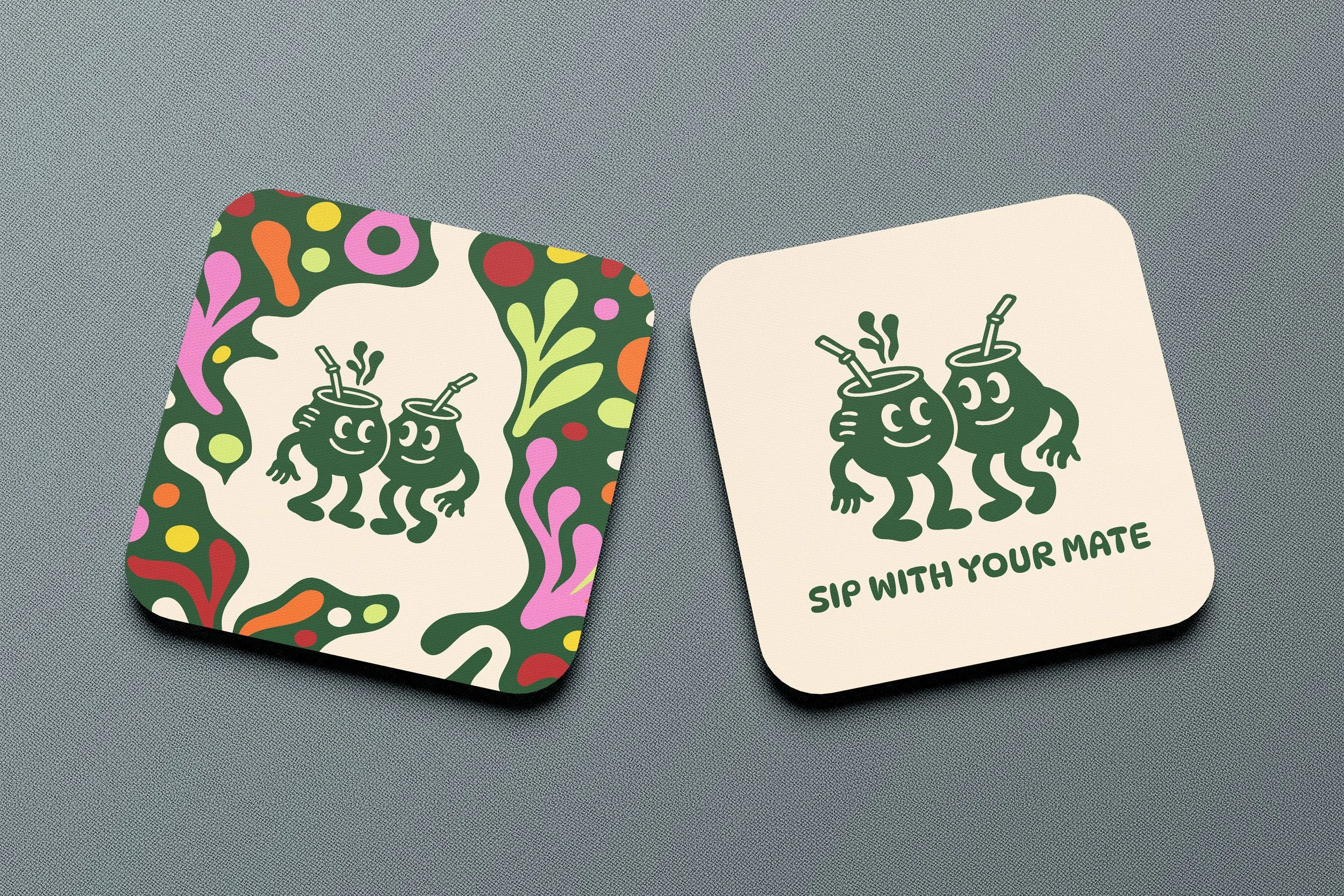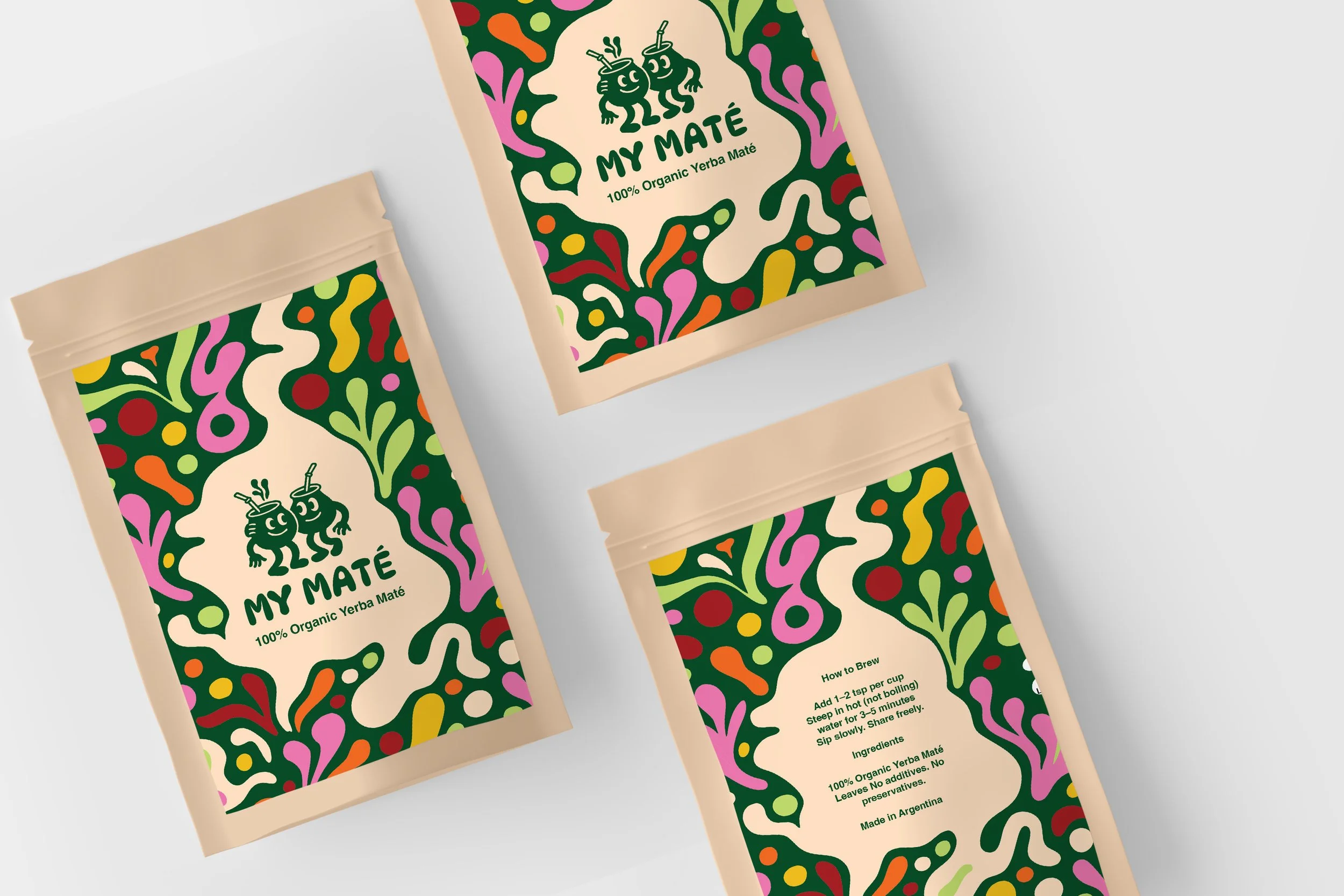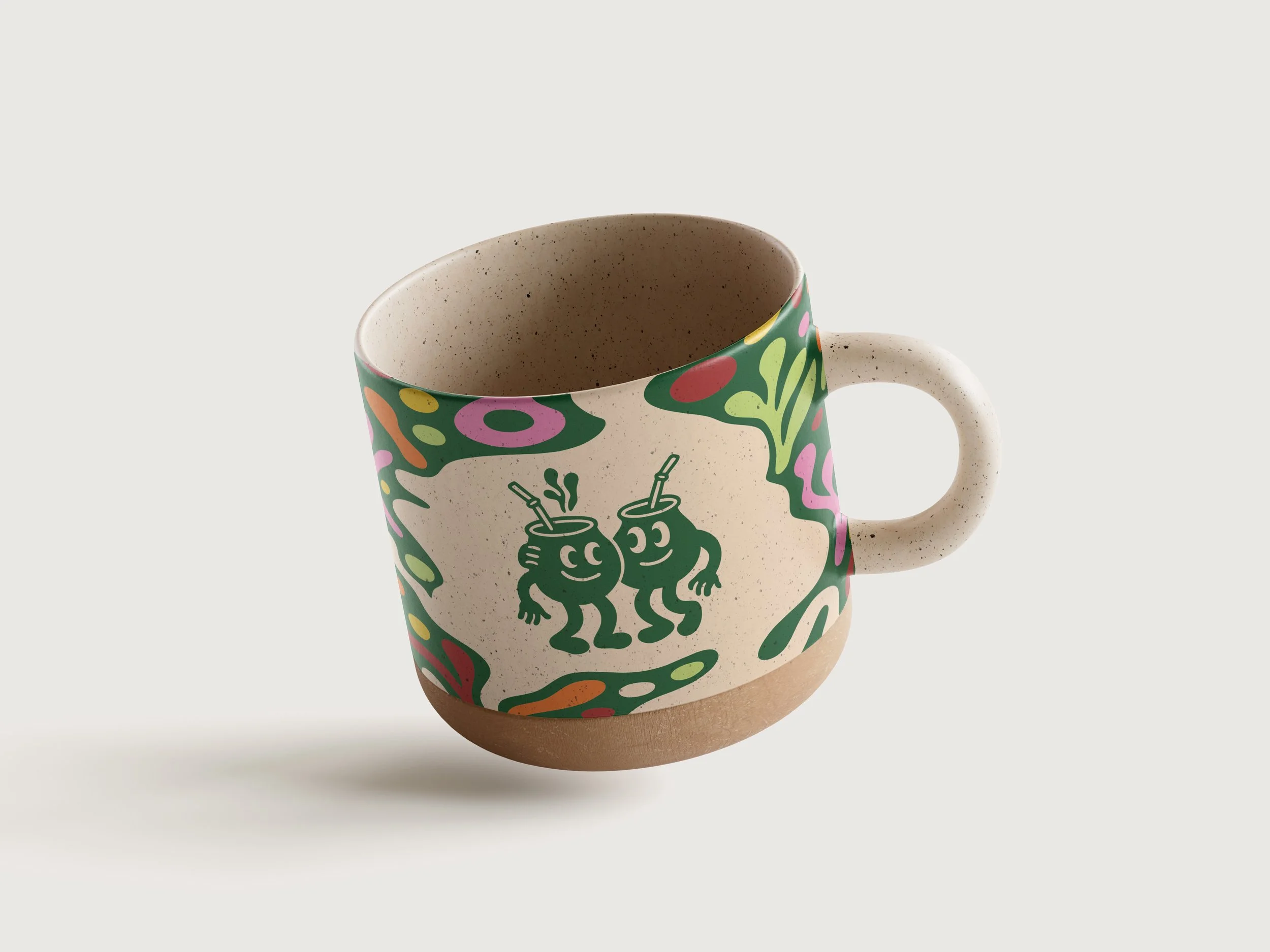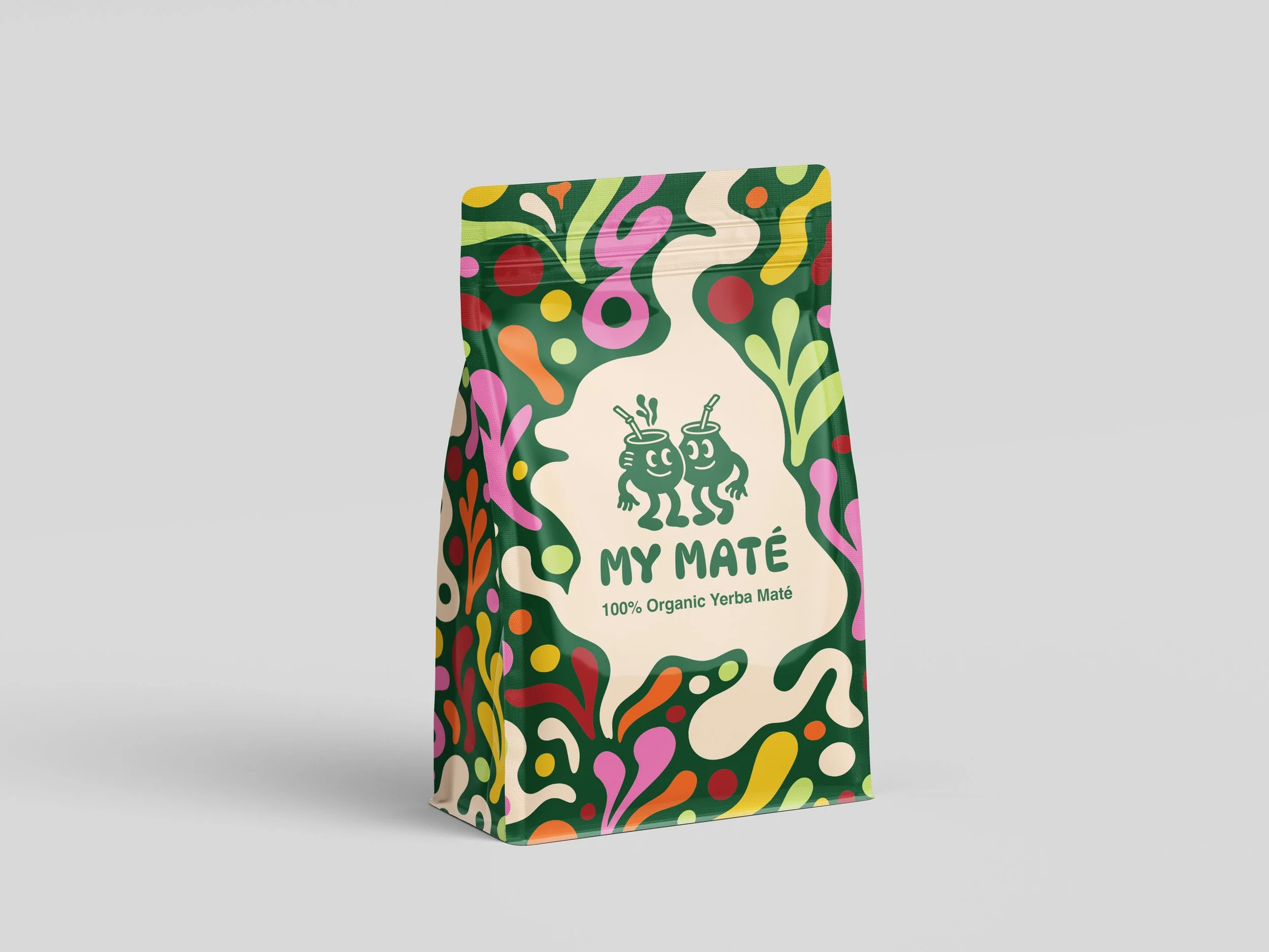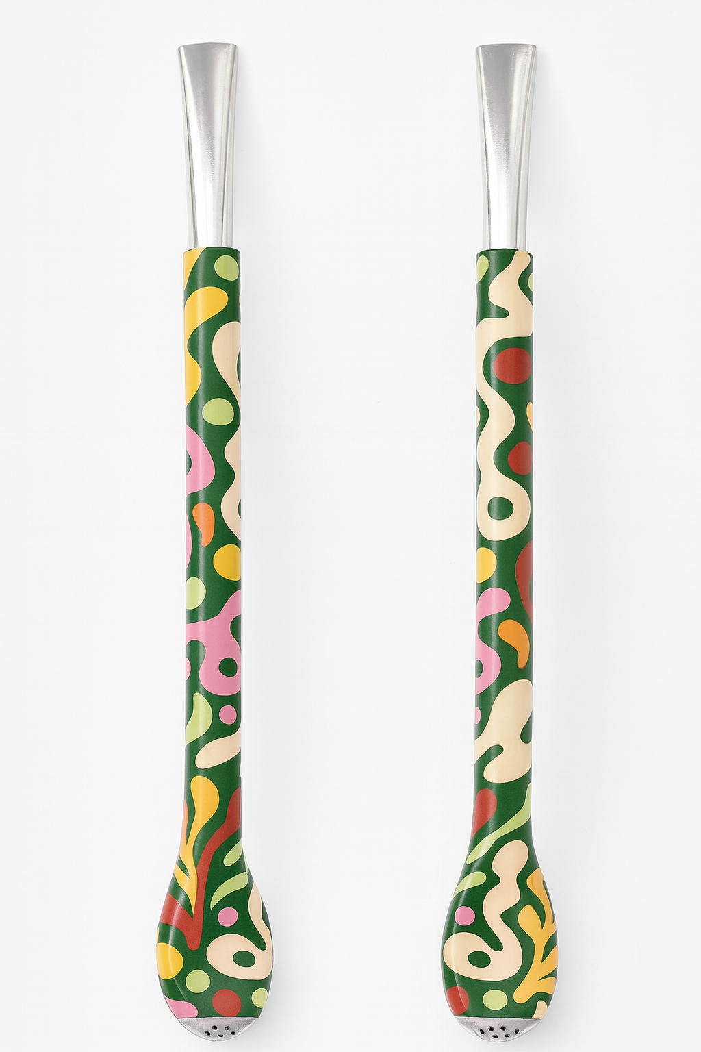
My Matè
Project: Branding / Rebranding
Client: Yerba Mate Australia
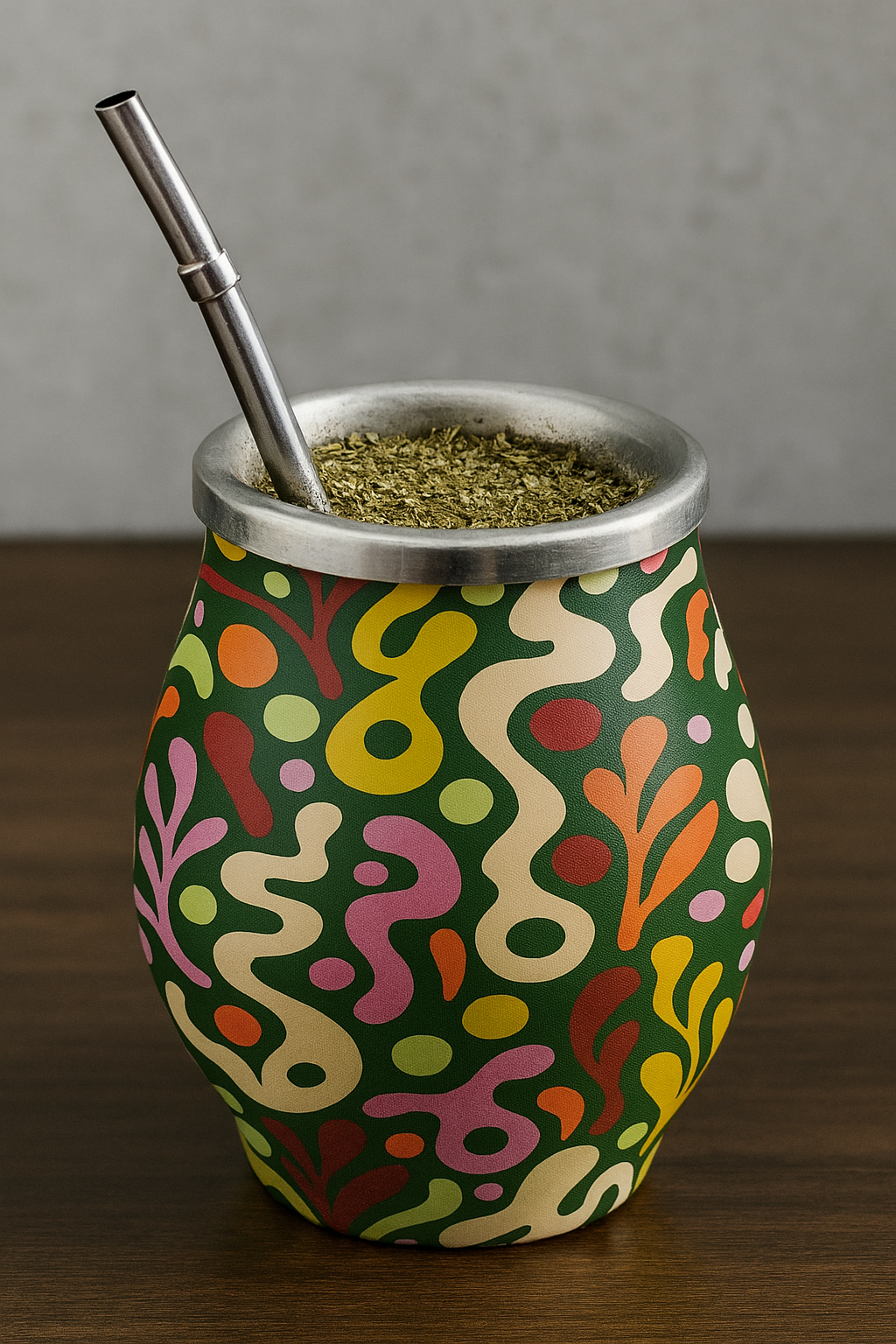
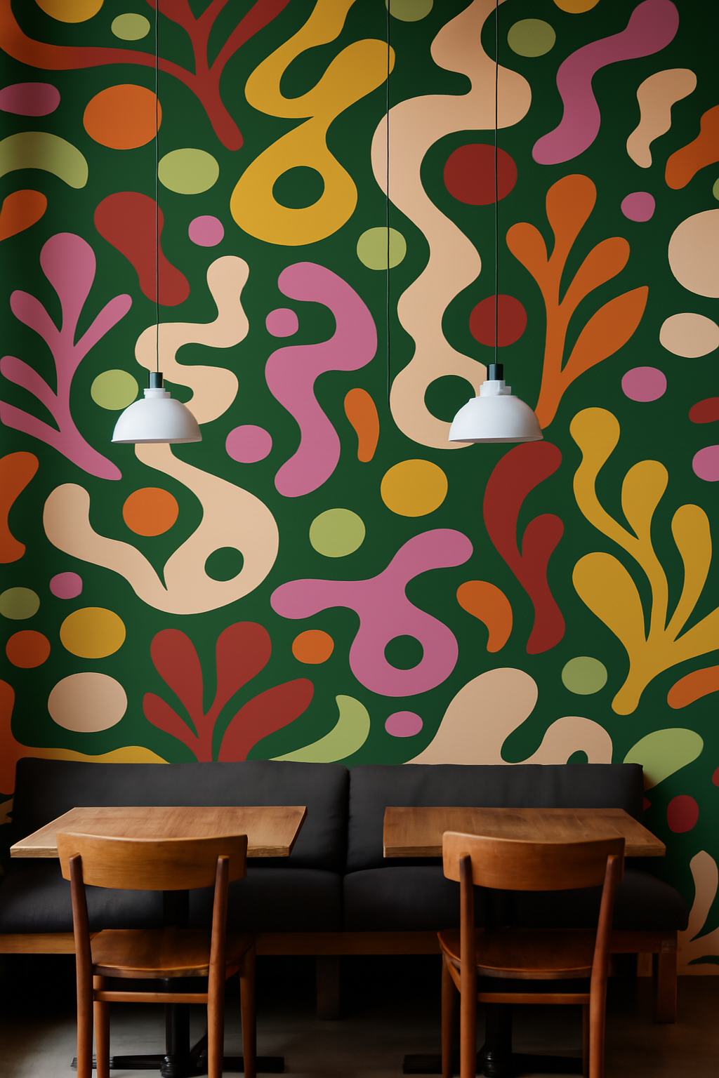
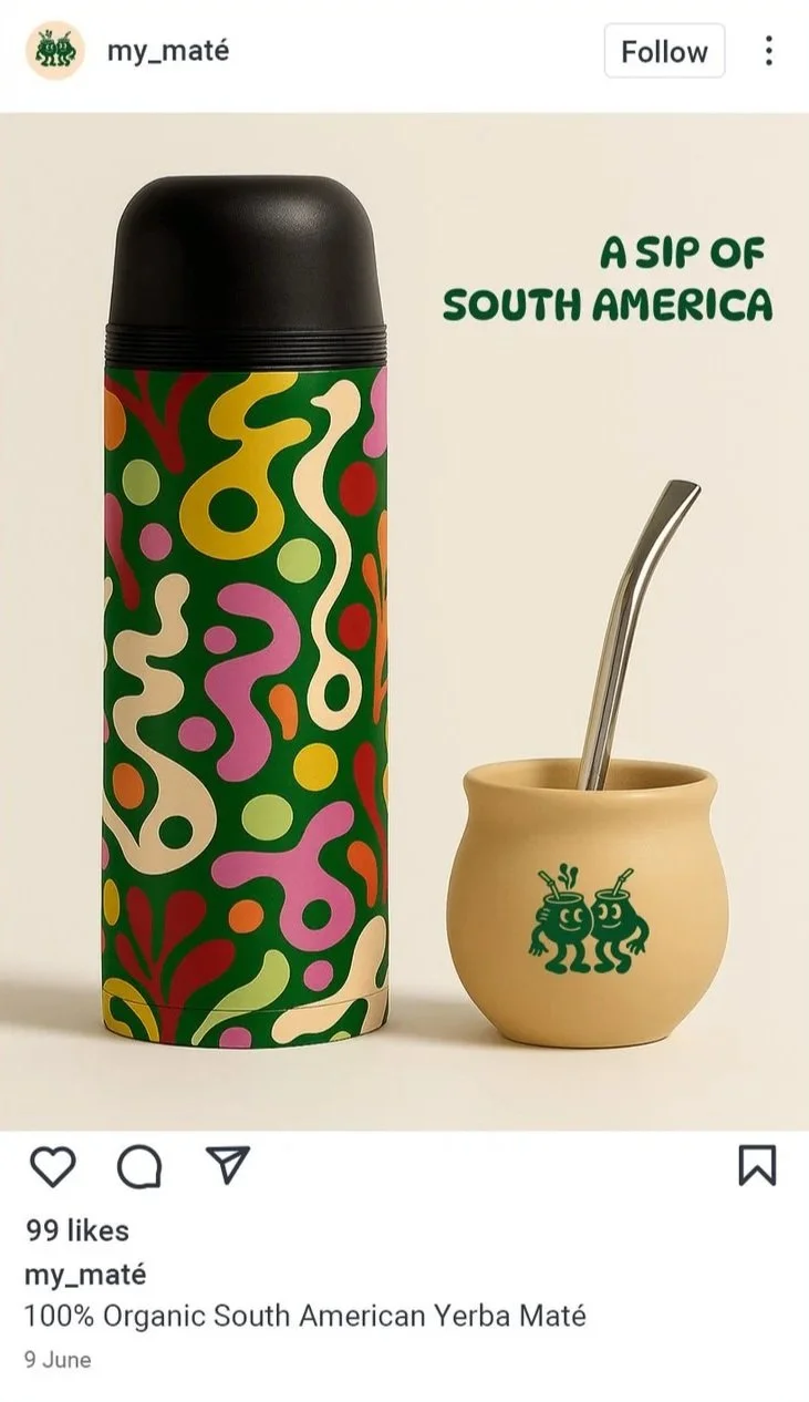
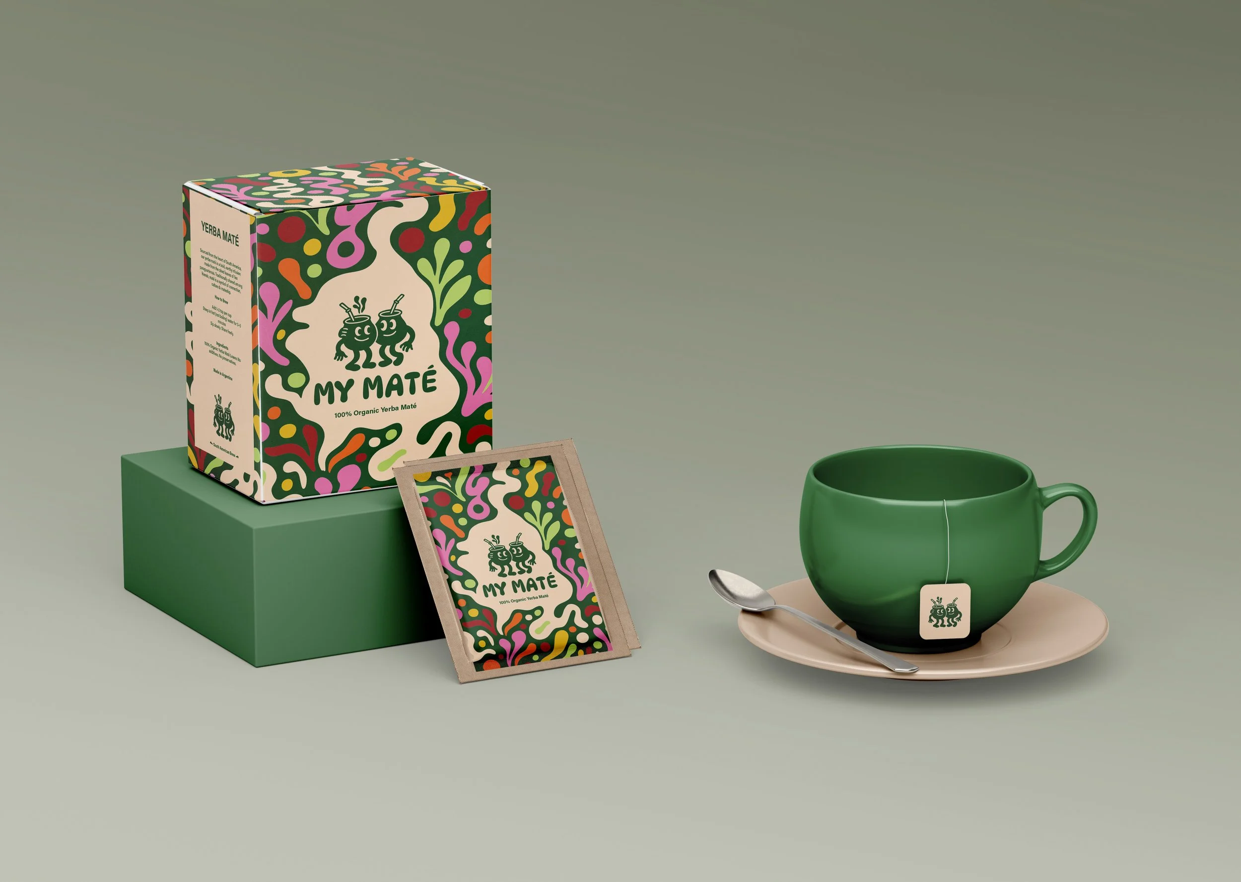
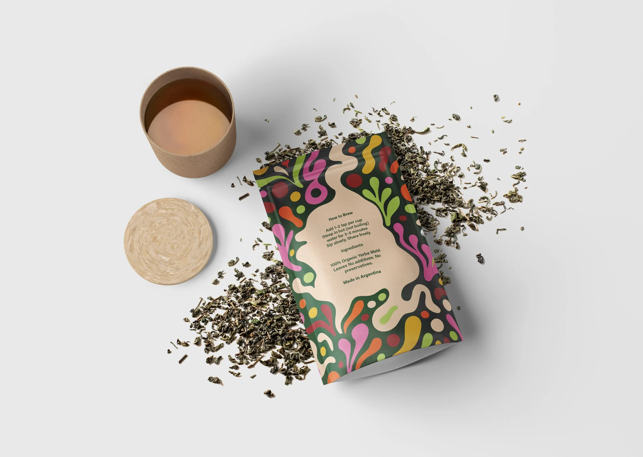
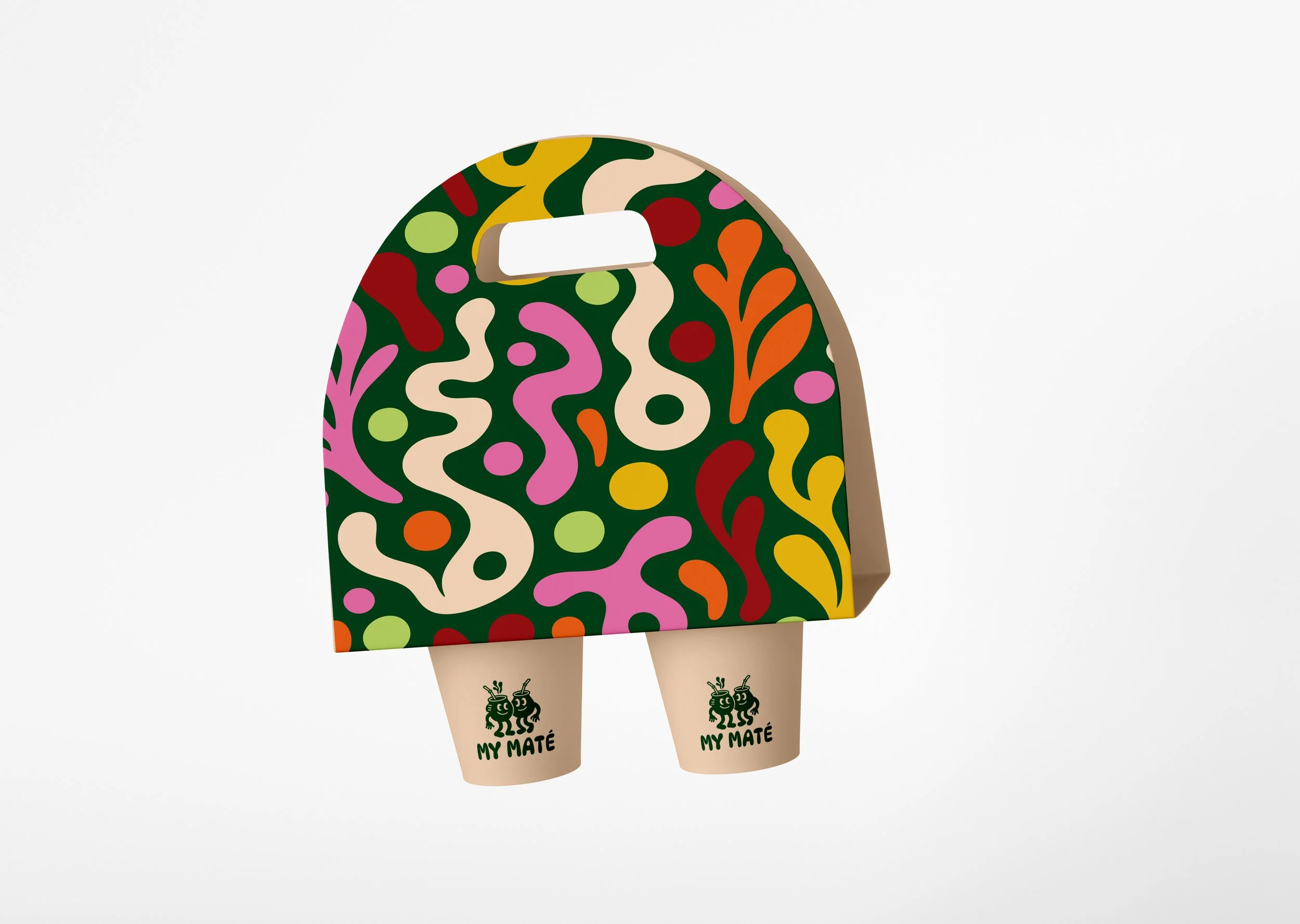
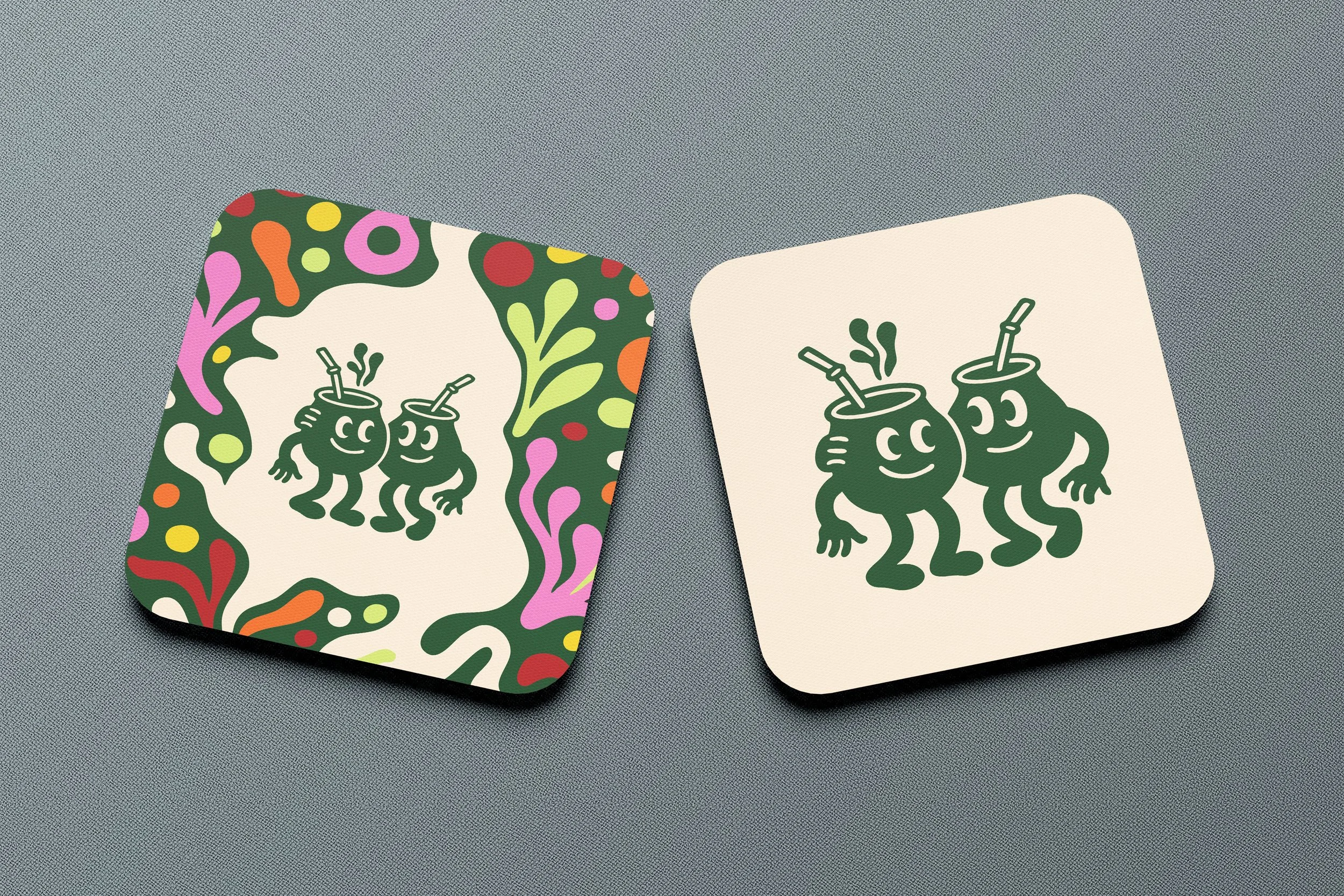
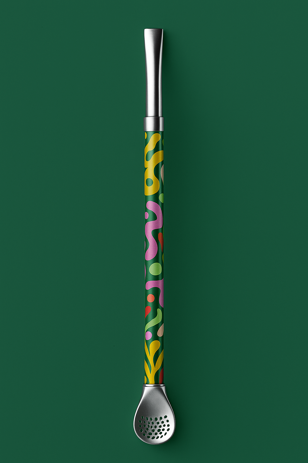
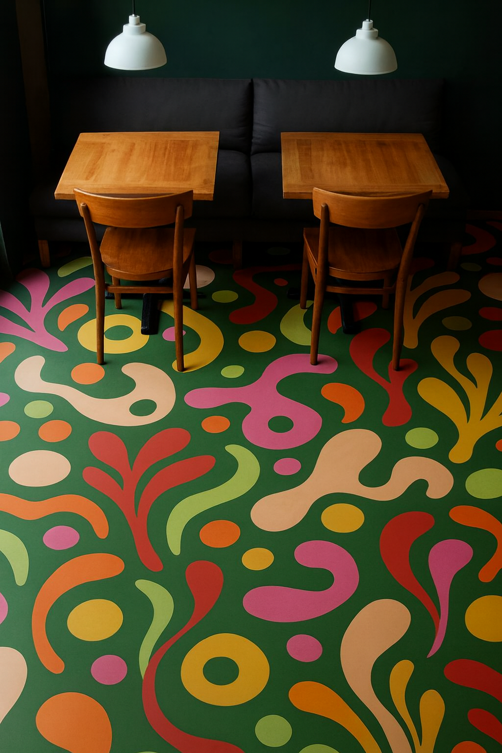
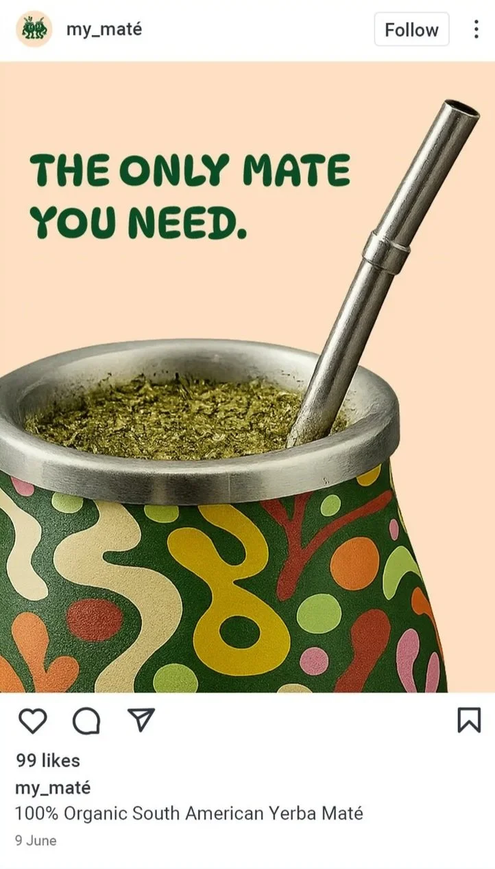
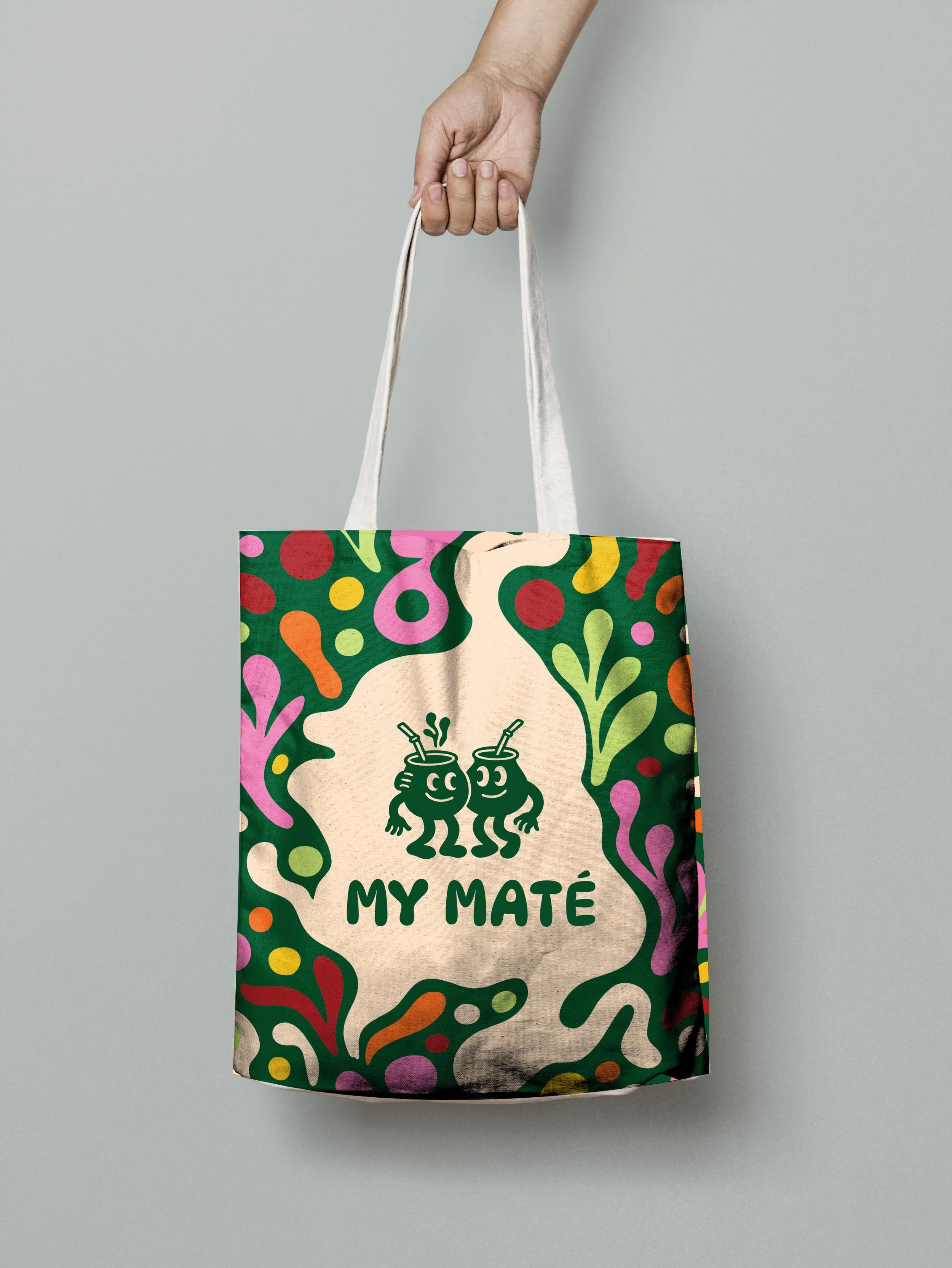
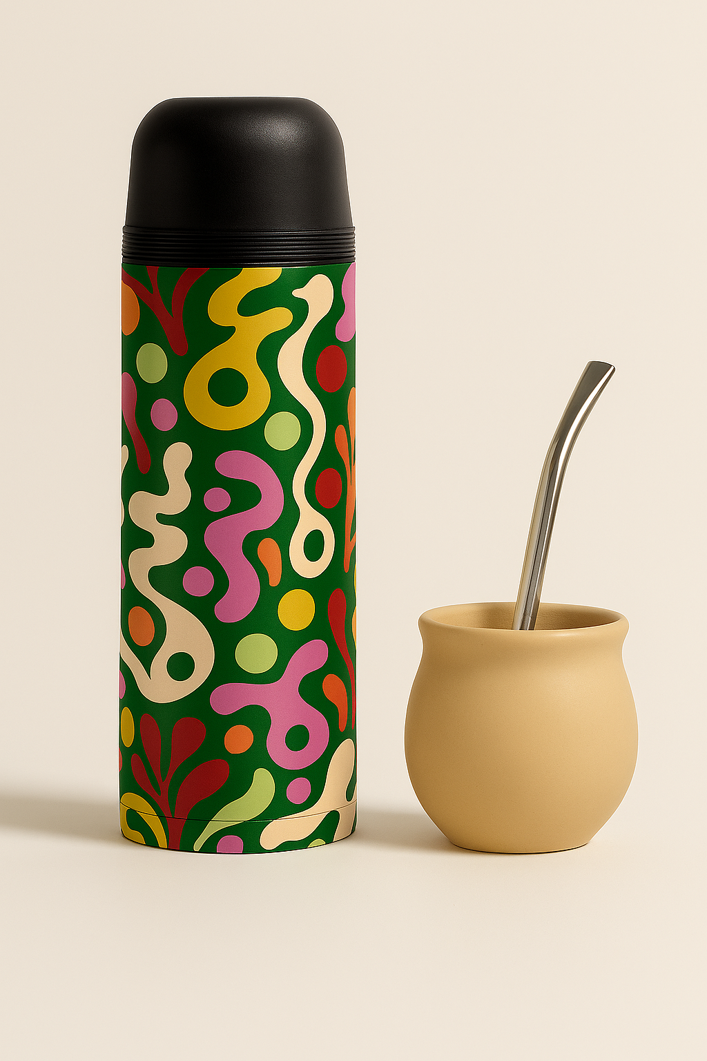
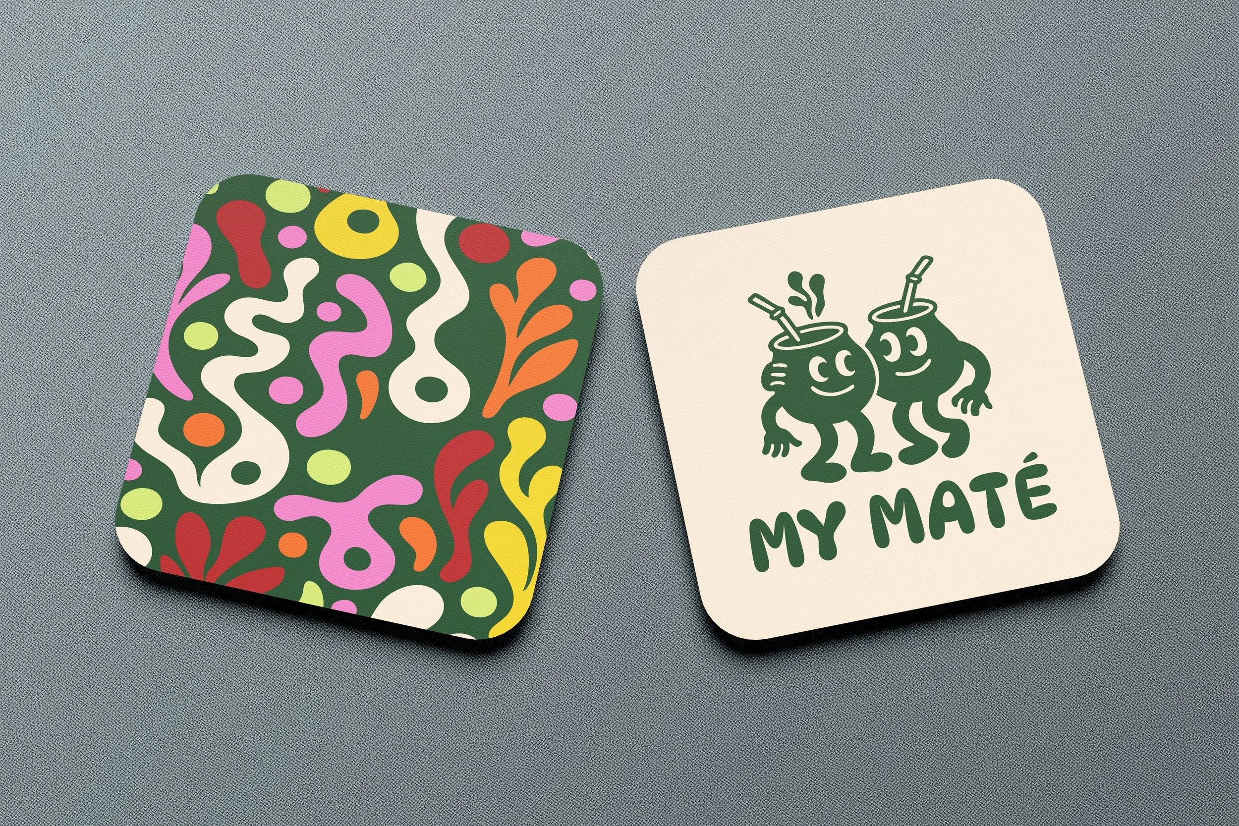
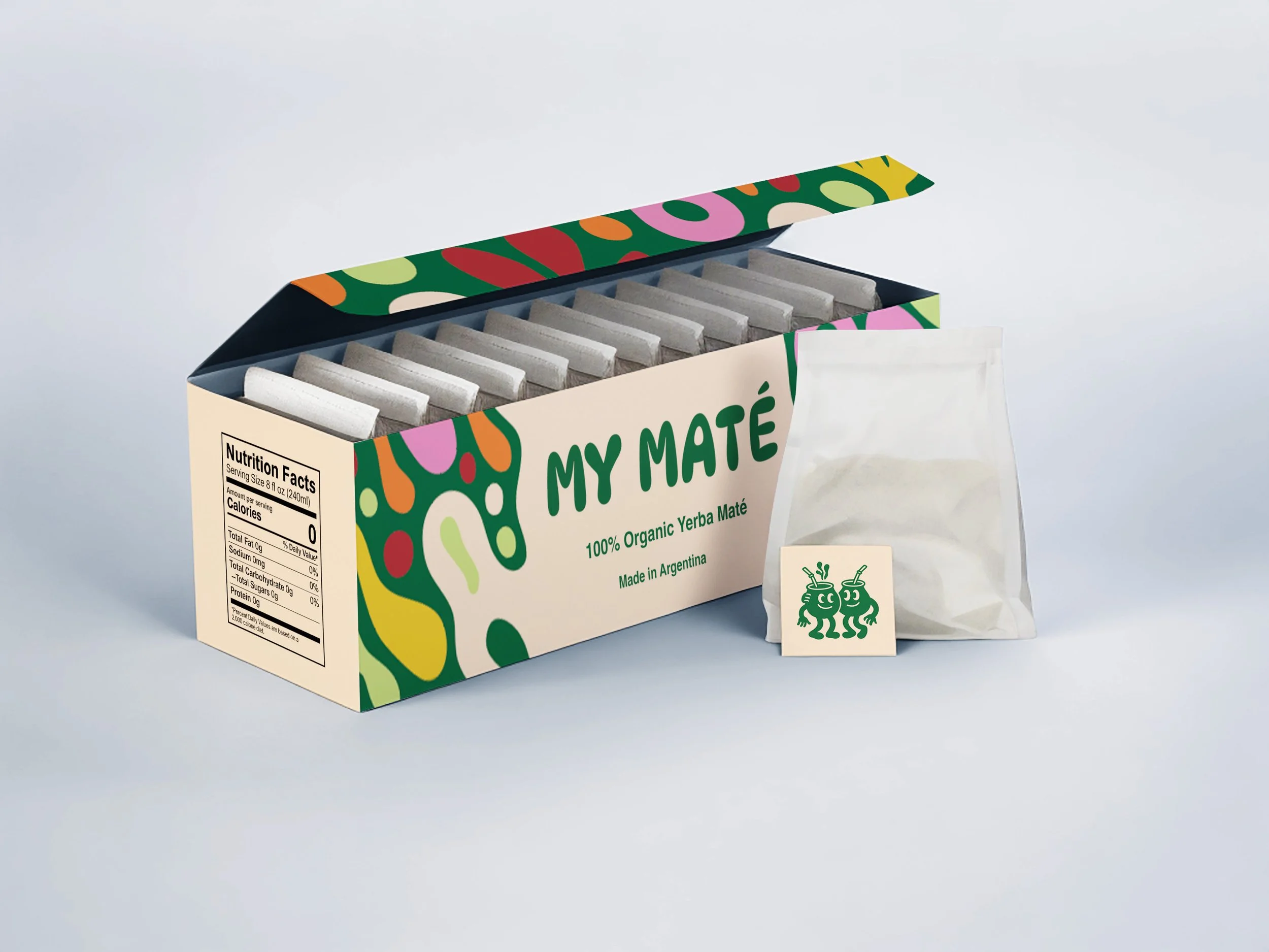
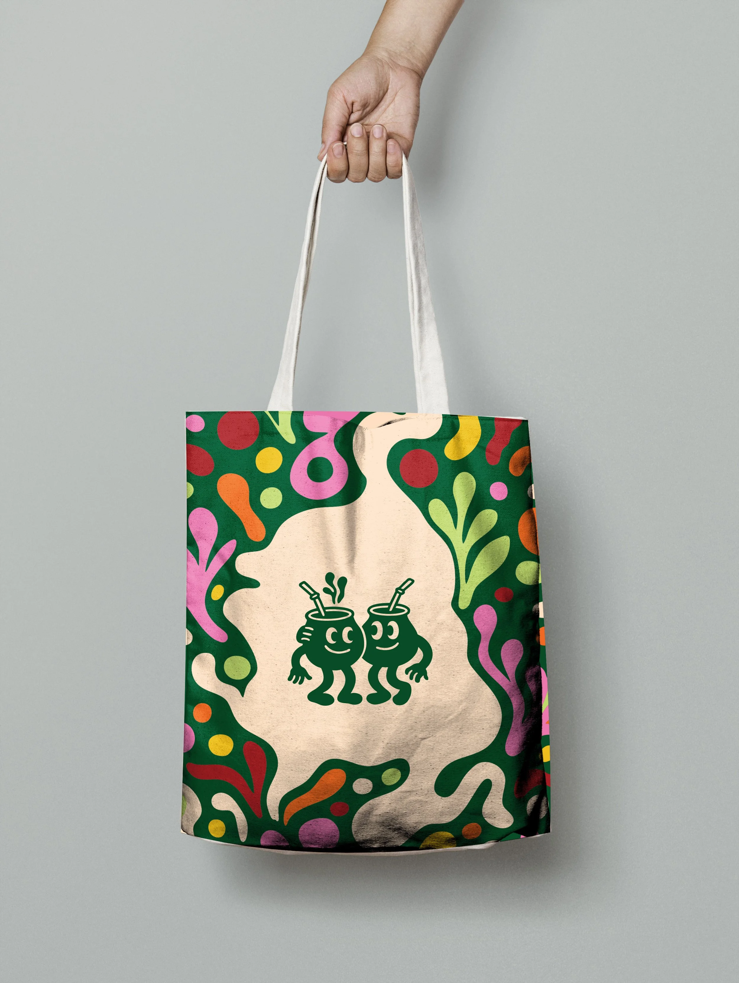
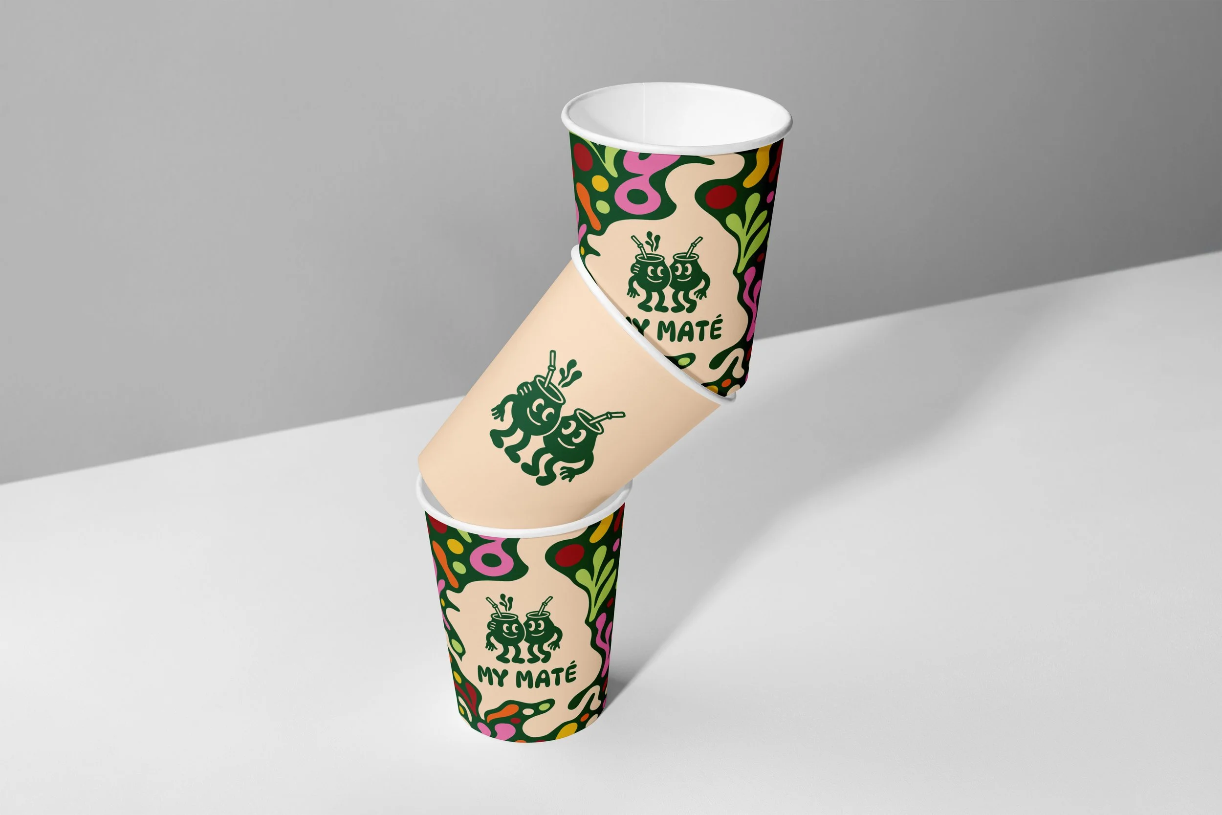
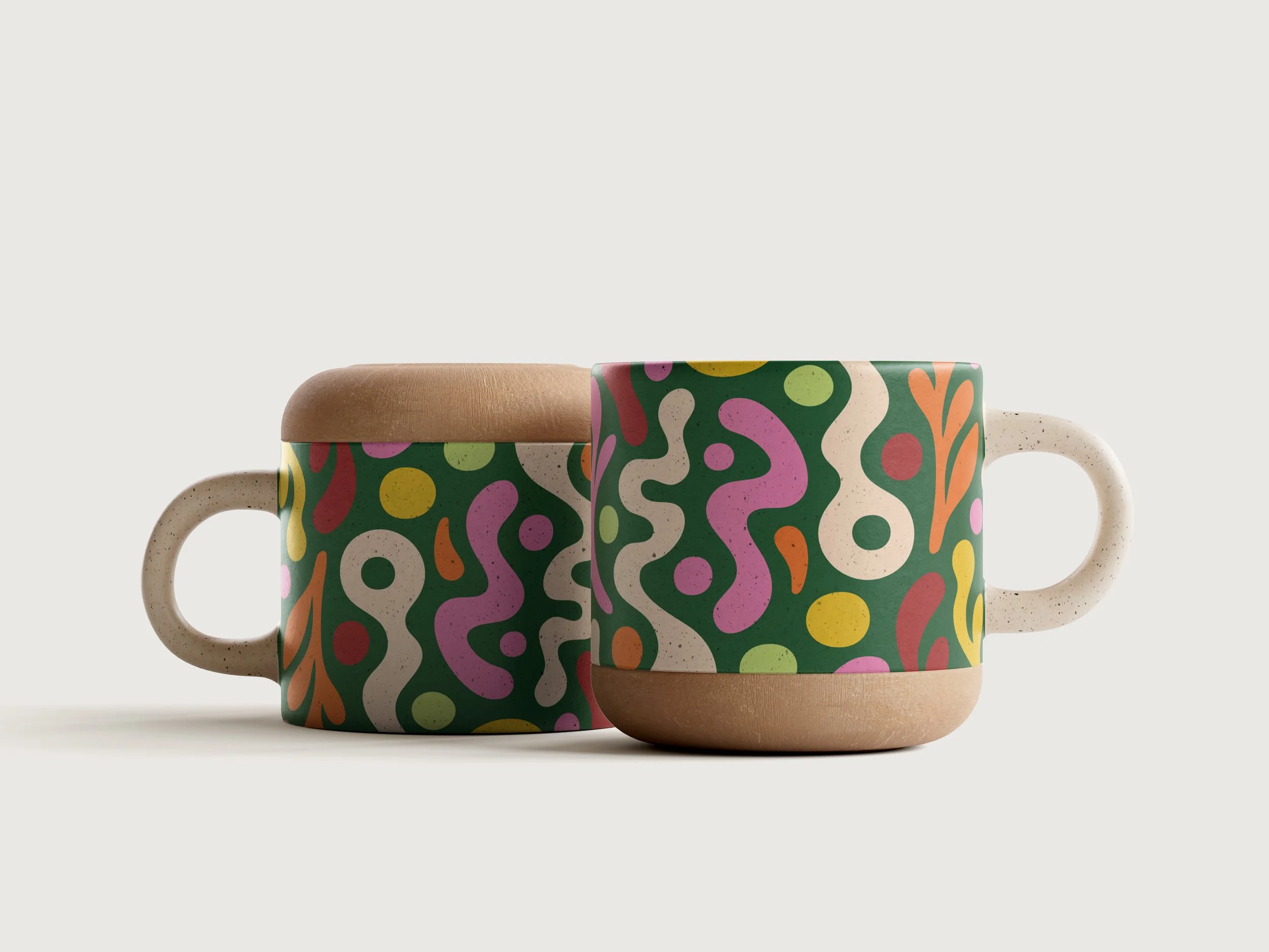
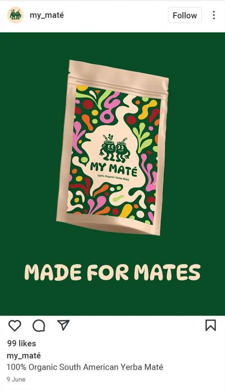
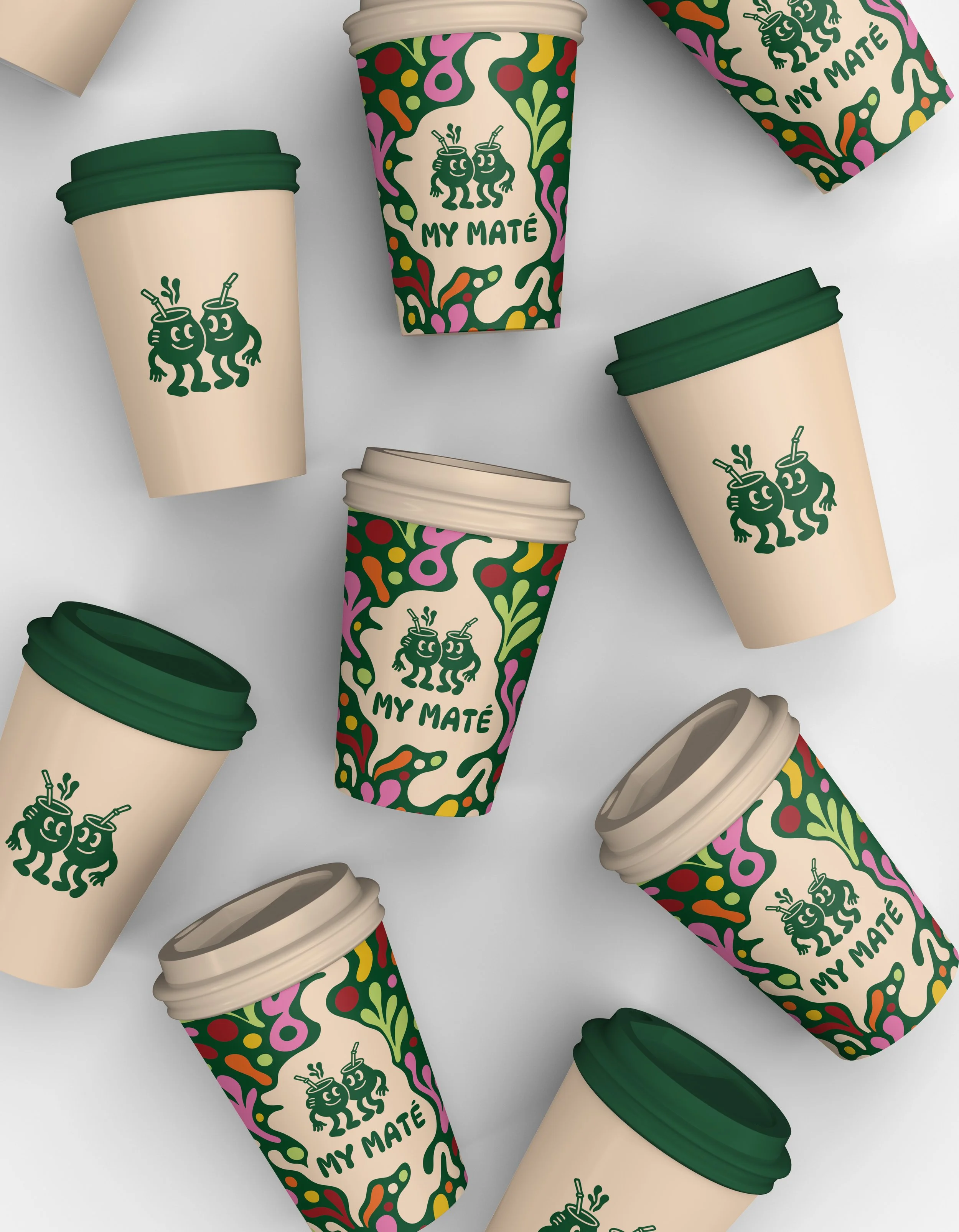
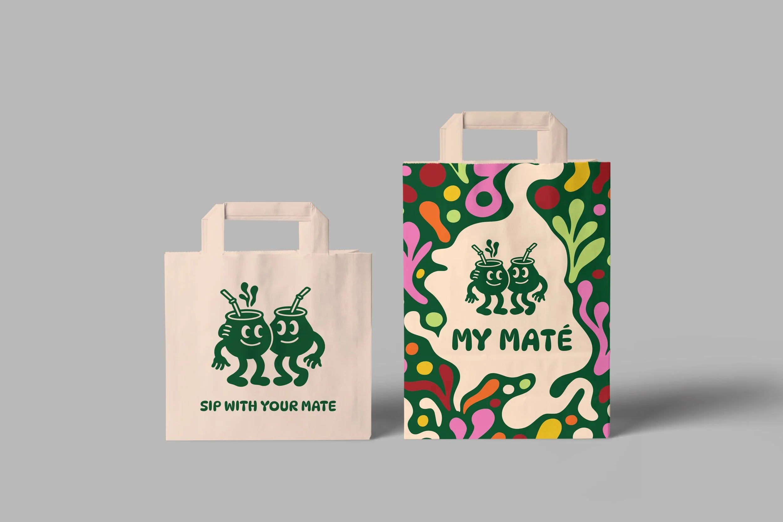
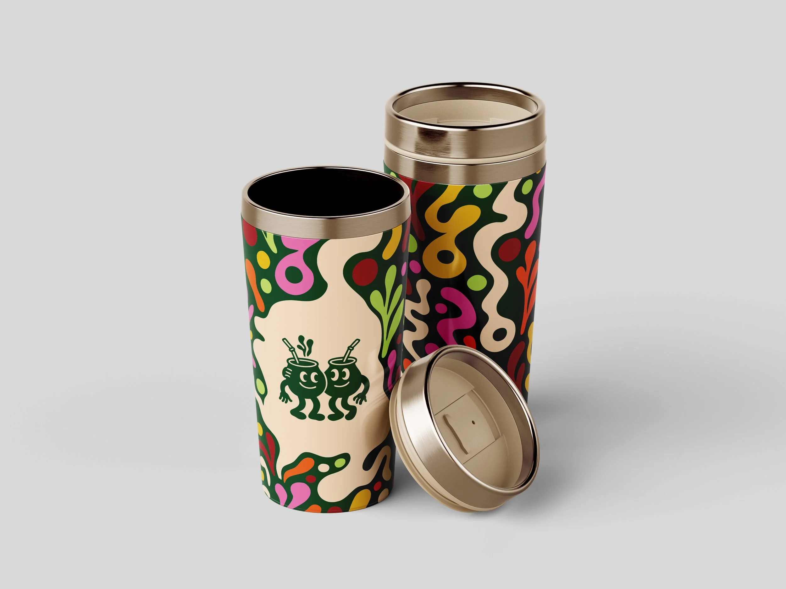
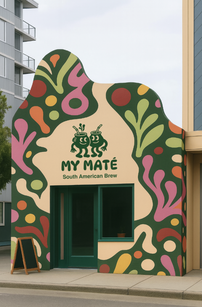
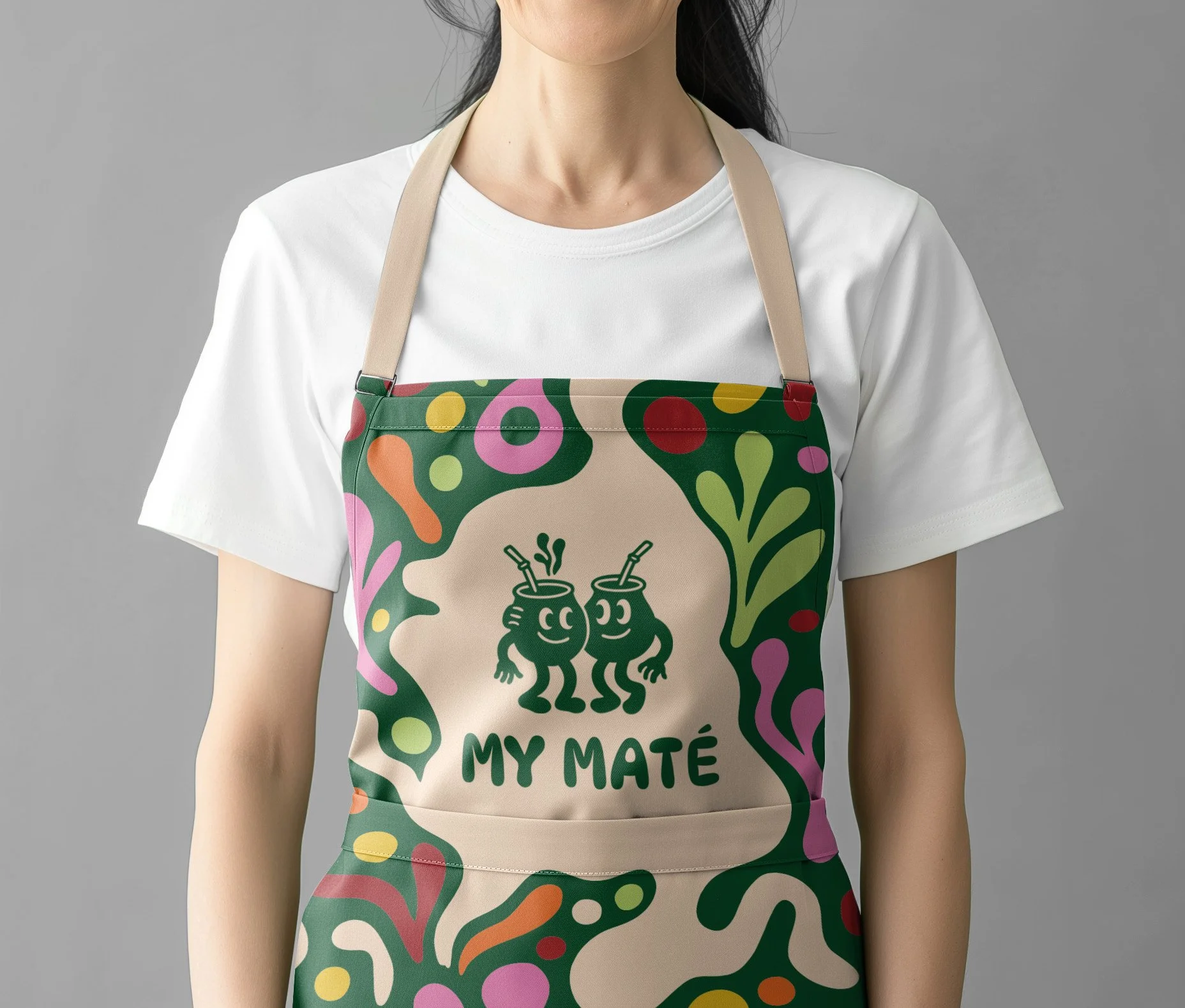
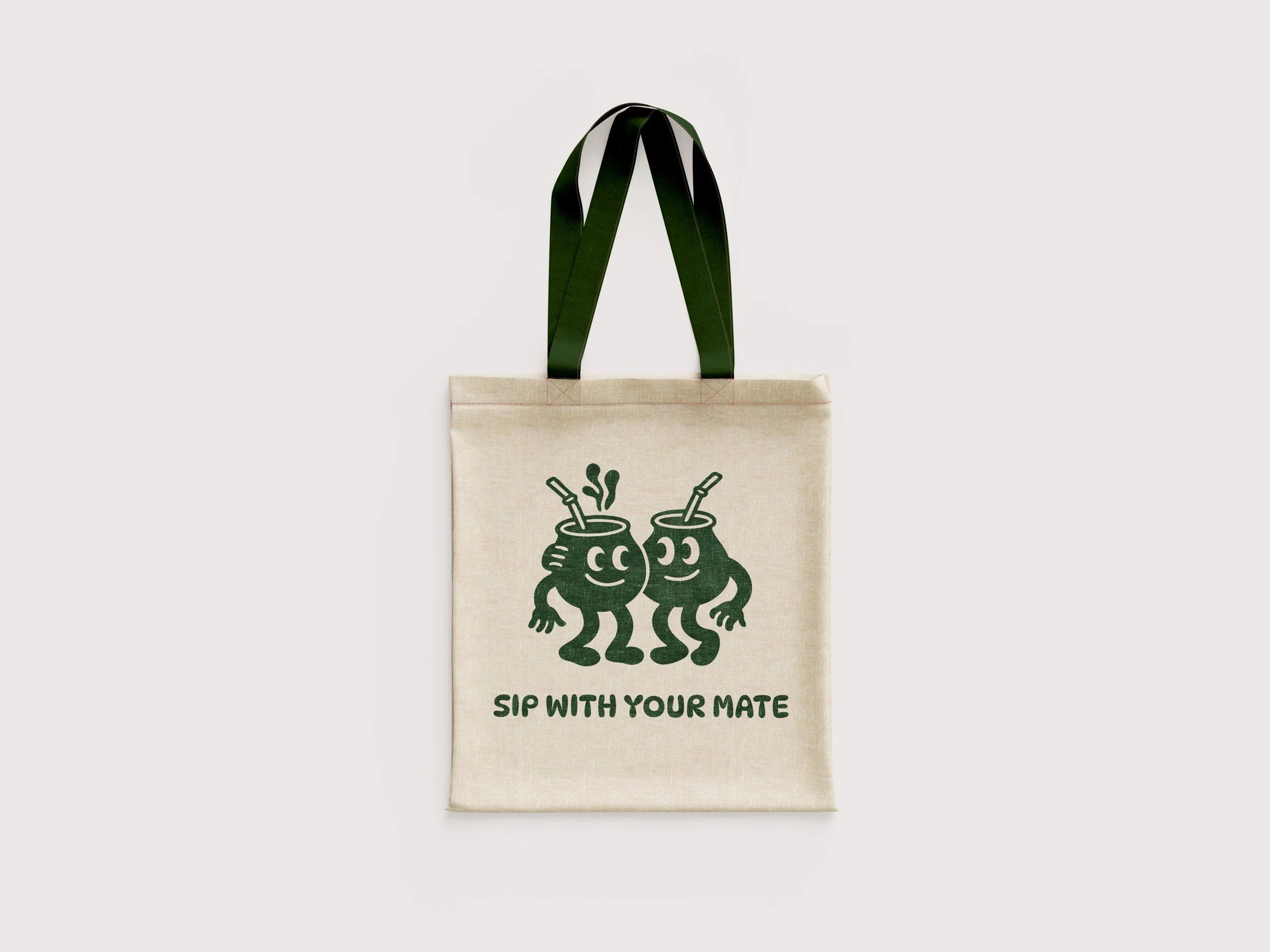
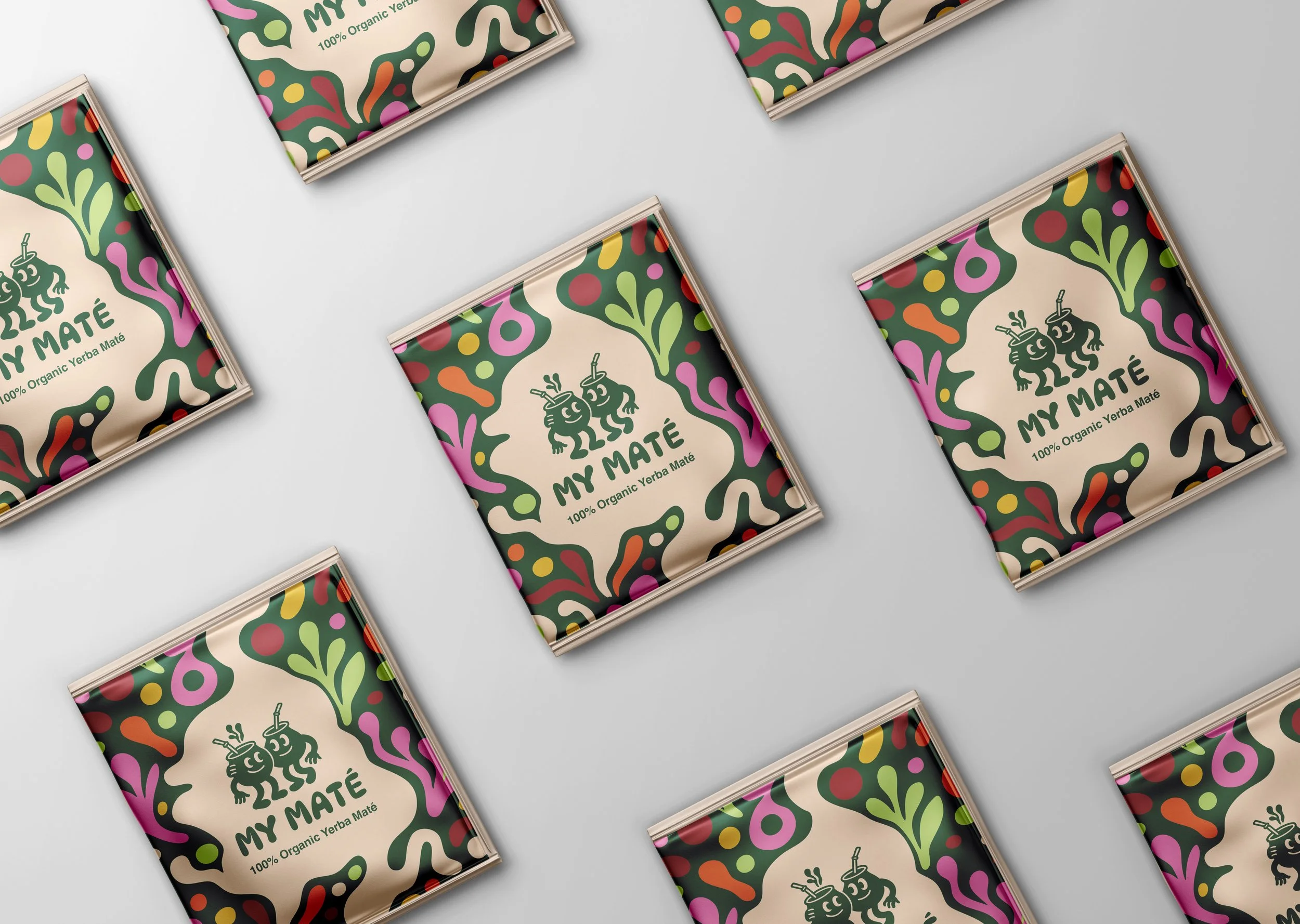
Project Description & Rationale: A vibrant and bold rebrand of Yerba Maté Australia, designed to bring South American heritage into a contemporary Australian and New Zealand café context. The identity uses organic patterns, energetic colour palettes, and a duo- maté cup character logo to embody energy, friendliness, South American Vibrancy and mateship. The design celebrates the rituals of drinking maté with friends, positioning the beverage as both a cultural connector and a modern lifestyle choice. The overall approach balances authenticity with approachability, making maté feel relevant to a younger, design-conscious audience.
Key Objectives:
Increase brand visibility and engagement across Australia and New Zealand
Build strong, recognisable brand identity and personality
Position maté as a culturally rich, social, and modern alternative to coffee and tea
Highlight the connection between South American tradition and contemporary café culture
Encourage a sense of community and shared experience around maté consumption